Balance Fish Food
The goal for this project was to create a new product in its packaging with an advertisement. We had to come up with what our product would be, the name of the product, and all other creative aspects.
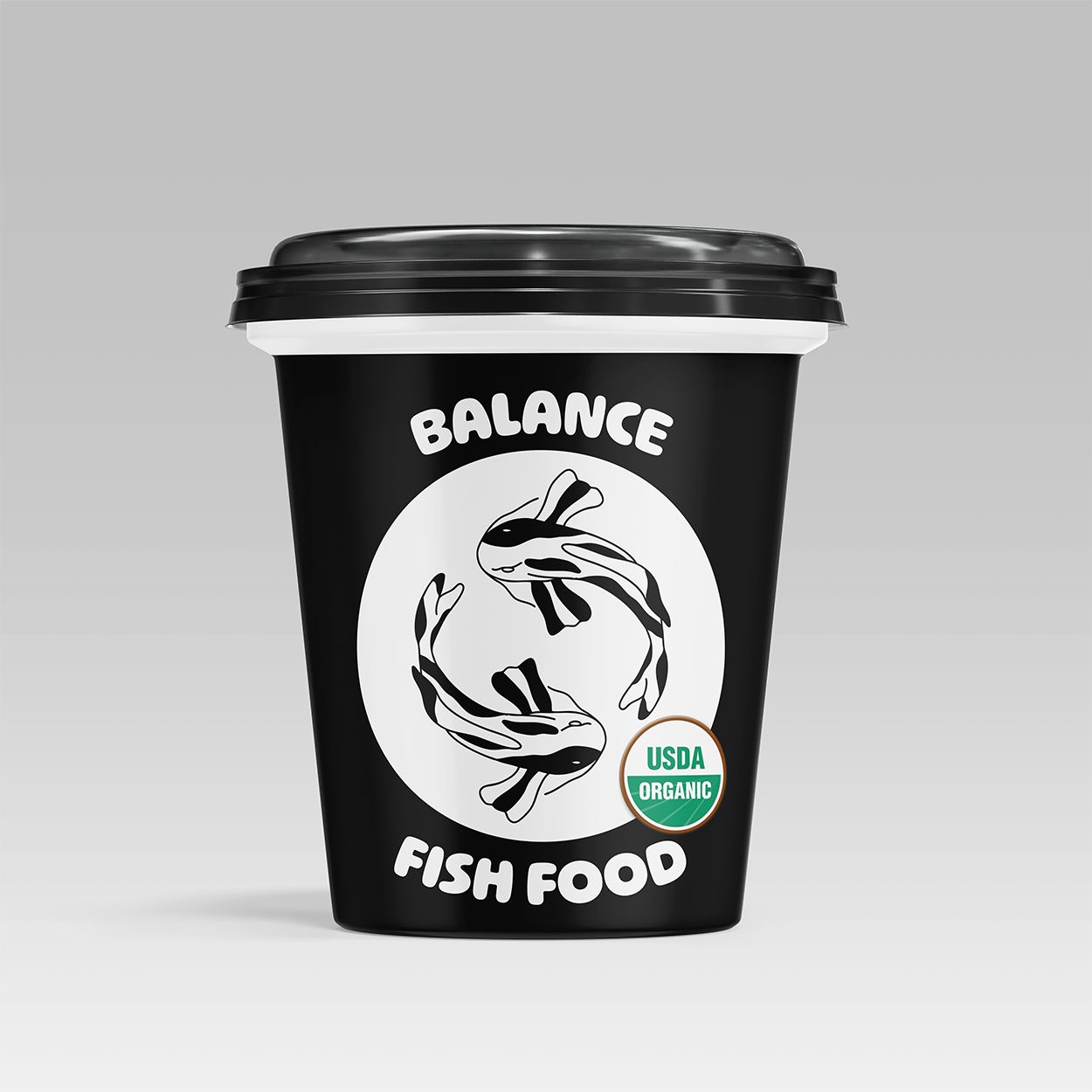
My idea was based on my aquarium maintenance work experience. A lot of work goes into maintaining the tank itself but making sure the fish are fed a proper diet is important as well.
I find minimalist product packaging draws my eye on a shelf. I wanted the design to emphasize “balance” and that the product was organic. I accomplished this with a hand illustrated logo of Koi fish, the selection of “Ohno Softie” for my font, and a black and white color scheme for balance and contrast.
The ads were created with versatility in mind. They could be either magazine, social media, or pop-up/website add.
Client
AB Tech Graphic Design
Project Timeline
December 2023